Lab 9: Interactive Dashboards
🧑💻 Make sure to finish previous labs before continuing with this lab! It might be tempting to skip some stuff if you’re behind, but you may just end up progressively more lost … we will happily answer questions from any lab each week 😃
5.12 UK Police Data 👮
This first part of the lab might feel harder than some previous labs … this is just because we’re near the pinnacle of the course!
The UK Police forces provide open access to certain crime and policing statistics via a web API, which is accessible from R. A “web API” is basically a website which you can talk to programmatically from your code, rather than having to copy and paste information into R.
We will end up putting much of the following into a Shiny dashboard, but it is often easier to get going with a simple script while you figure out the code you’re going to run, then transfer it into the dashboard layout. A lot of real data science work is messy, so we’re going to go through the messiness of accessing a real-live web API like this, where the data is often provided not in the way we want!
Note: we are no longer going to tell you to look at the documentation. From the context of the question, it should be obvious when you need to look up documentation now! This is a vital skill to develop.
Exercise 5.84 Install the ukpolice R package.
How can we list all the police forces in England and Wales?
What is the id for Durham Constabulary?
Click for solution
## SOLUTION

install.packages("ukpolice")
Then to find the list of forces we need to explore the package documentation.
Click on the “Packages” tab in the bottom right pane of RStudio, find the ukpolice package and click on the name to bring up the list of functions.
It is easy to find the function ukc_forces in the list, which provides England and Wales police force names.
library("ukpolice")
forces <- ukc_forces()
This is easiest to look at in the RStudio viewer by either clicking on it in the Environment tab (top right) or by running the code it would invoke anyway:
View(forces)durham.
Exercise 5.85 What are the policing neighborhoods in Durham Constabulary?
Save the latitude and longitude of the boundary for Durham City policing neighborhood. Make sure that the data is numeric and correct if not.
Click for solution
From the help files we can see that the neighborhoods for a force can be found with the ukc_neighbourhoods() function:
## SOLUTION

nbd <- ukc_neighbourhoods("durham")
Looking at them, we can see Durham City has policing neighborhood id DHAM1.
View(nbd)From the package documentation again, we can see that the function ukc_neighbourhood_boundary() will provide the geolocations we need:
bdy <- ukc_neighbourhood_boundary("durham", "DHAM1")
str(bdy)
tibble [460 × 2] (S3: tbl_df/tbl/data.frame)
$ latitude : chr [1:460] "54.783588954" "54.783572991" "54.783600112" "54.783620262" ...
$ longitude: chr [1:460] "-1.581641524" "-1.58118144" "-1.580706918" "-1.5802962179999" ...However, upon inspection, we can see that the info returned has been treated as a string (this is common in dealing with web APIs).
We can get some tidyverse help to convert this to numeric information:
library(tidyverse)

bdy <- bdy |>
  mutate(latitude = as.numeric(latitude),
         longitude = as.numeric(longitude))
We saw previously how to integrate mapping into ggplot2, but when mapping is our sole focus there are even better tools available.
One of the best R packages for mapping is called leaflet.
Exercise 5.86 Install the leaflet package.
Modify the following code, replacing the ??? so that it shows the boundary of Durham City policing neighborhood in Durham Constabulary.
library("leaflet")

leaflet() |>
  addTiles() |>
  addPolygons(lng = ???, lat = ???, label = "Durham City")
Your solution should look like this (see after for solution code):
Click for solution
## SOLUTION

library("leaflet")

leaflet() |>
  addTiles() |>
  addPolygons(lng = bdy$longitude, lat = bdy$latitude, label = "Durham City")
For the next part to work, you will need an additional utility package for mapping called sf (though you don’t need to call it yourself!)
Install this package before you proceed:
install.packages("sf")Exercise 5.87 Using the ukc_crime_poly function in the ukpolice API, download the most recent month of crime data for Durham City policing neighbourhood in Durham Constabulary. (Note: you have some work to do before calling the function, because the names in your boundary data frame are different to those required by the function!)
Do you get an error?
If you Google the error, can you think of anything to do to fix it?
Click for solution
When looking at the function help for ukc_crime_poly, we see that it wants a data frame with two columns, lat and lng, so we need to change the column names in bdy before proceeding.
## SOLUTION

bdy2 <- bdy |>
  select(lat = latitude,
         lng = longitude)
crimes <- ukc_crime_poly(bdy2)
Request returned error code: 414crimesNULLWe get a 414 error code.
Upon Googling this, we see reference to the request being too long.
Our request consists of the boundary polygon, so maybe this is too detailed (check: it does consist of 460 vertices!)
We can try reducing the length by taking 100 evenly spaced vertices (there are many ways you could subset the rows, don’t worry if you took a different approach that worked!)
bdy2 <- bdy |>
  select(lat = latitude,
         lng = longitude)

bdy2 <- bdy2[round(seq(1, nrow(bdy2), length.out = 100)), ]

crimes <- ukc_crime_poly(bdy2)
crimes
# A tibble: 192 × 13
category type context persistent_id id subtype month latitude longitude
<chr> <chr> <chr> <chr> <int> <chr> <chr> <chr> <chr>
1 anti-soc… Force "" "" 1.26e8 "" 2025… 54.7744… -1.570952
2 anti-soc… Force "" "" 1.26e8 "" 2025… 54.7742… -1.583624
3 anti-soc… Force "" "" 1.26e8 "" 2025… 54.7775… -1.578522
4 anti-soc… Force "" "" 1.26e8 "" 2025… 54.7720… -1.575314
5 anti-soc… Force "" "" 1.26e8 "" 2025… 54.7778… -1.581286
6 anti-soc… Force "" "" 1.26e8 "" 2025… 54.7767… -1.578779
7 anti-soc… Force "" "" 1.26e8 "" 2025… 54.7769… -1.575372
8 anti-soc… Force "" "" 1.26e8 "" 2025… 54.7764… -1.585280
9 anti-soc… Force "" "" 1.26e8 "" 2025… 54.7654… -1.561523
10 anti-soc… Force "" "" 1.26e8 "" 2025… 54.7775… -1.578522
# ℹ 182 more rows
# ℹ 4 more variables: street_id <int>, street_name <chr>,
# outcome_status_category <chr>, outcome_status_date <chr>This is best viewed in the RStudio browser:
View(crimes)Exercise 5.88 You will notice that the API only returns the data for the most recent available month (which is most likely a month or two ago due to a lag in the data release).
Query the API multiple times to gather together the data for the most recent available 6 months into one data frame.
Click for solution
Looking in the data frame, we see that the most recent month is 2024-09 … or September this year.
## SOLUTION

crimes <- rbind(ukc_crime_poly(bdy2, "2024-09"),
                ukc_crime_poly(bdy2, "2024-08"),
                ukc_crime_poly(bdy2, "2024-07"),
                ukc_crime_poly(bdy2, "2024-06"),
                ukc_crime_poly(bdy2, "2024-05"),
                ukc_crime_poly(bdy2, "2024-04"))
dim(crimes)
[1] 1447 13Exercise 5.89 Plot a ggplot2 bar chart showing the number of each category of crime committed.
Extend the bar chart by breaking down each bar to show the outcome status counts and tidy up the axes and legend labels.
Click for solution
Note: the second plot below will look awful here, because the web-page is not wide enough … in your RStudio session you can make the plot area wider by dragging the vertical panel divider so that it is properly visible.
## SOLUTION

# First basic plot
ggplot(crimes) +
  geom_bar(aes(y = category))
# Show outcome status
ggplot(crimes) +
  geom_bar(aes(y = category, fill = outcome_status_category)) +
  labs(y = "Crime", fill = "Outcome Status")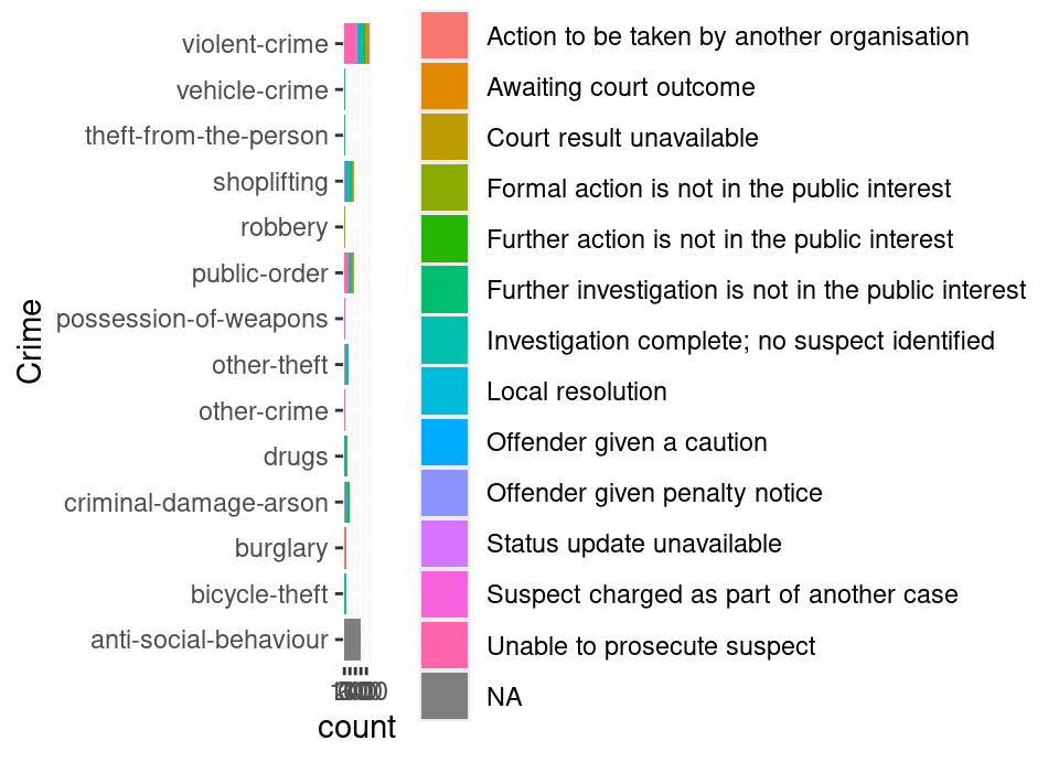
Exercise 5.90 By using the addCircles() function in the leaflet package, add the locations of the crimes in red on top of the map above which showed the boundary of Durham City policing neighborhood in Durham Constabulary.
The label of each point should be the category of crime committed so that when you hover your mouse over a point it shows you the crime.
Your solution should look like this (see after for solution code):
Click for solution
Notice care is needed again, because the crimes data frame is all text data, so we must convert the latitude and longitude when providing to the map!
## SOLUTION

leaflet() |>
  addTiles() |>
  addPolygons(lng = bdy$longitude, lat = bdy$latitude) |>
  addCircles(lng = as.numeric(crimes$longitude), lat = as.numeric(crimes$latitude), label = crimes$category, color = "red")
5.13 Getting interactive …
We now want to put the above together into an interactive dashboard! Our goal will be to create a drop down list with the neighbourhoods for the user to select one, and then have a text input where they can write the “Year-Month” they want (in more advanced Shiny we could create a calendar date picker, but this lab is already long enough!)
Exercise 5.91 If you look at the Shiny help for selectInput(), you will see that choices has to be a named vector. For example, passing
c("first" = "one", "second" = "two", "third" = "three")would result in the user seeing first/second/third in the drop down list, and us being able to access one/two/three when the server code runs. This is the scenario when accessing the neighborhoods, as we need the id but want the user to see the nice name!
Save just the neighborhood ids into a vector (eg called nbd2), then overwrite the names of each vector element with the nicely formatted neighborhood names.
Click for solution
## SOLUTION

nbd <- ukc_neighbourhoods("durham")
nbd2 <- nbd$id
names(nbd2) <- nbd$name
Exercise 5.92 Create a Shiny application and paste the code for the last solution just above the ui creation part.
Then, create a UI which has a sidebar containing a text input (for year and month) and a drop down list with all the Durham Constabulary neighborhoods in.
Leave the main panel empty and leave an empty server for now.
Click for solution
The whole app.R file should read:
library("shiny")
library("ukpolice")

nbd <- ukc_neighbourhoods("durham")
nbd2 <- nbd$id
names(nbd2) <- nbd$name

# Define UI for application
ui <- fluidPage(
  titlePanel("UK Police Data"),
  sidebarLayout(
    sidebarPanel(
      selectInput("nbd", "Choose Durham Constabulary Neighborhood", nbd2),
      textInput("date", "Enter the desired year and month in the format YYYY-MM", value = "2024-09")
    ),

    # Show a plot of the generated distribution
    mainPanel(
      "Nothing to see here yet!"
    )
  )
)

# Define server logic
server <- function(input, output) {
}

# Run the application
shinyApp(ui = ui, server = server)
Exercise 5.93 Next, we want to add the bar chart and a leaflet map in the main panel.
You saw how to add a plot placeholder in the lecture. Use the function leafletOutput() to define an output area for the map in the main panel.
Finally, add the server logic. You saw the paired render function for plotting in lectures. The paired render function for the leaflet map is renderLeaflet().
Click for solution
The whole app.R file should read:
library("shiny")
library("ukpolice")
library("tidyverse")
library("leaflet")

nbd <- ukc_neighbourhoods("durham")
nbd2 <- nbd$id
names(nbd2) <- nbd$name

# Define UI for application
ui <- fluidPage(
  titlePanel("UK Police Data"),
  sidebarLayout(
    sidebarPanel(
      selectInput("nbd", "Choose Durham Constabulary Neighborhood", nbd2),
      textInput("date", "Enter the desired year and month in the format YYYY-MM", value = "2024-09")
    ),

    # Show a plot of the generated distribution
    mainPanel(
      plotOutput("barchart"),
      leafletOutput("map")
    )
  )
)

# Define server logic
server <- function(input, output) {
  # Get boundaries for selected neighbourhood
  # Wrapped in a reactive because we need this to trigger a
  # change when the input neighborhood changes
  bdy <- reactive({
    bdy <- ukc_neighbourhood_boundary("durham", input$nbd)
    bdy |>
      mutate(latitude = as.numeric(latitude),
             longitude = as.numeric(longitude))
  })

  # Get crimes for selected neighbourhood
  # Also wrapped in a reactive because we need this to trigger a
  # change when the boundary above, or date, changes
  crimes <- reactive({
    bdy2 <- bdy() |>
      select(lat = latitude,
             lng = longitude)

    ukc_crime_poly(bdy2[round(seq(1, nrow(bdy2), length.out = 100)), ], input$date)
  })

  # First do plot
  output$barchart <- renderPlot({
    ggplot(crimes()) +
      geom_bar(aes(y = category, fill = outcome_status_category)) +
      labs(y = "Crime", fill = "Outcome Status")
  }, res = 96)

  # Then do map
  output$map <- renderLeaflet({
    leaflet() |>
      addTiles() |>
      addPolygons(lng = bdy()$longitude, lat = bdy()$latitude) |>
      addCircles(lng = as.numeric(crimes()$longitude), lat = as.numeric(crimes()$latitude), label = crimes()$category, color = "red")
  })
}

# Run the application
shinyApp(ui = ui, server = server)
🏁🏁 Done, end of lab! 🏁🏁