WS 3b: Advanced Graphics
🧑💻 Make sure to finish previous work sheets before continuing with this one! It might be tempting to skip some stuff if you’re behind, but you may just end up progressively more lost … we will happily answer questions from any work sheet each week 😃
Note: for all plotting in this work sheet, be sure to use the new ggplot2 capabilities from the most recent lecture practical, not the base R plotting you learned in Statistical Inference II.
Note 2: part of learning R is learning to read documentation, so we’re going to be doing more of that again in this work sheet: it is not possible to cover every function, argument, etc in lectures!
5.7 Joining data frames
Before moving on to graphics, we first wrap up the new data manipulation features learned in the lecture practical.
First, we load the tidyverse package since we’ll need it for both the data manipulation and advanced graphics functionality, then load some miniature practice data for joining which is about band members of the Beatles 🪲 and Rolling Stones 🗿 🎶
library("tidyverse")

data("band_members", package = "dplyr")
data("band_instruments", package = "dplyr")
data("band_instruments2", package = "dplyr")
Exercise 5.59 Look at the three data frames you loaded above, band_members, band_instruments and band_instruments2.
- Join the
band_membersandband_instrumentsdata frames so that you have a single data frame containing the name, band and instrument of just the 3 people who play an instrument. - This time, using the
band_membersandband_instruments2data frames, create a single data frame containing all the people who have a known band, together with what instrument (if any) they play (Hint: pay close attention to the variable names, you may need to make changes before joining) - Finally, using either instruments data frame, create a data frame containing only complete information for people with a known band and who play an instrument.
Click for solution
# A tibble: 3 × 2
  name  band
  <chr> <chr>
1 Mick  Stones
2 John  Beatles
3 Paul Beatles# A tibble: 3 × 2
name plays
<chr> <chr>
1 John guitar
2 Paul bass
3 Keith guitar# A tibble: 3 × 2
artist plays
<chr> <chr>
1 John guitar
2 Paul bass
3 Keith guitarJoining with `by = join_by(name)`# A tibble: 3 × 3
name band plays
<chr> <chr> <chr>
1 John Beatles guitar
2 Paul Beatles bass
3 Keith <NA> guitar# (ii) do the harder join
# There are many ways to do this, this is just one example
left_join(band_members,
band_instruments2 |>
select(name = artist, plays))Joining with `by = join_by(name)`# A tibble: 3 × 3
name band plays
<chr> <chr> <chr>
1 Mick Stones <NA>
2 John Beatles guitar
3 Paul Beatles bass Joining with `by = join_by(name)`# A tibble: 2 × 3
name band plays
<chr> <chr> <chr>
1 John Beatles guitar
2 Paul Beatles bass In fact, there is a very handy extra argument we didn’t cover in lectures which all the _join() functions support, called by. This allows you to avoid having to do the renaming of columns like you did in answering (ii) above.
Exercise 5.60 Look at the documentation for left_join and read the explanation in the Arguments section for by.
Use this, to join the band_members and band_instruments2 data frames, without renaming the artist column first.
Click for solution
## SOLUTION

# Compare this to what you did in (ii) above
left_join(band_members, band_instruments2, by = c("name" = "artist"))
# A tibble: 3 × 3
name band plays
<chr> <chr> <chr>
1 Mick Stones <NA>
2 John Beatles guitar
3 Paul Beatles bass 5.8 Car efficiency 🚗🏎🚙
Load the mpg data in the ggplot2 package to examine some data on fuel efficiency.
Look at the help file to see the variables available (recall: ?ggplot2::mpg) … you’ll need to map the plots requested below to the correct variable from the documentation.
Exercise 5.61 Produce a scatter plot of the fuel efficiency on a highway (motorway) against the engine’s size (aka displacement).
There are a few vehicles with large engines that have unusually high fuel efficiency for such big engines. Colour the points by the type of car. Can you explain these cars?
To make this even clearer, remove the colouring but split the plot into facets where you have a graphic per car type.
Add to this collection of plots the fuel efficiency for city driving, coloured in red. Update the y-axis to be called “Fuel efficiency” to reflect that it is not only the
hwyvariable plotted now.
Click for solution
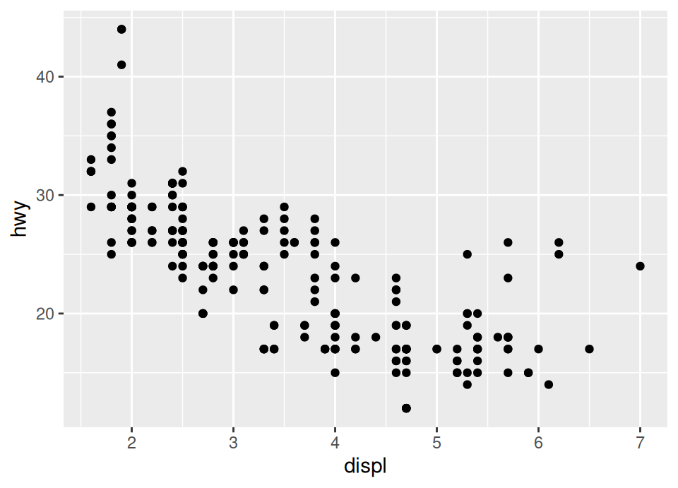
# i) We see from the documentation that the car type is in variable "class" so
#    we add an aesthetic for colour with that variable in the geom
ggplot(mpg, aes(x = displ, y = hwy)) +
  geom_point(aes(colour = class))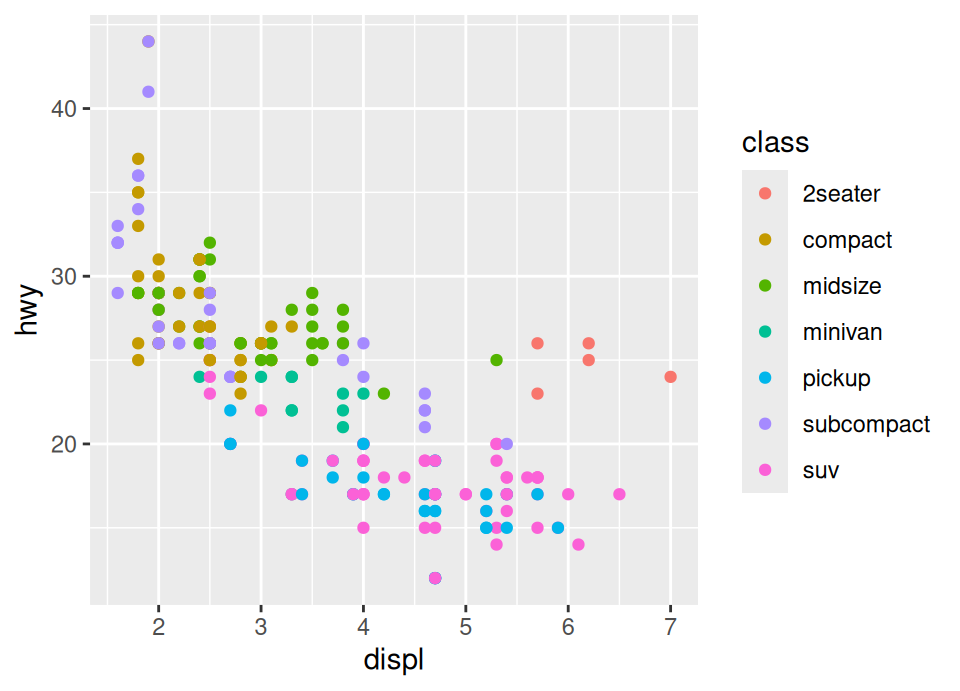
We notice that 5 of the 6 points which have a large engine and higher than expected efficincy are 2-seater cars … so these are probably sports cars which are lighter and despite having large engines use slightly less fuel.
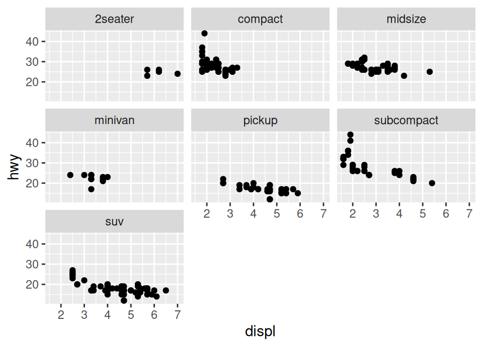
# iii)
# Now we're adding another geom_point, overriding the y mapping with the cty
# variable, and putting the colour argument *outside* the aesthetic because it
# applies to all these points and is not data dependent
ggplot(mpg, aes(x = displ, y = hwy)) +
  facet_wrap(~ class) +
  geom_point() +
  geom_point(aes(y = cty), colour = "red")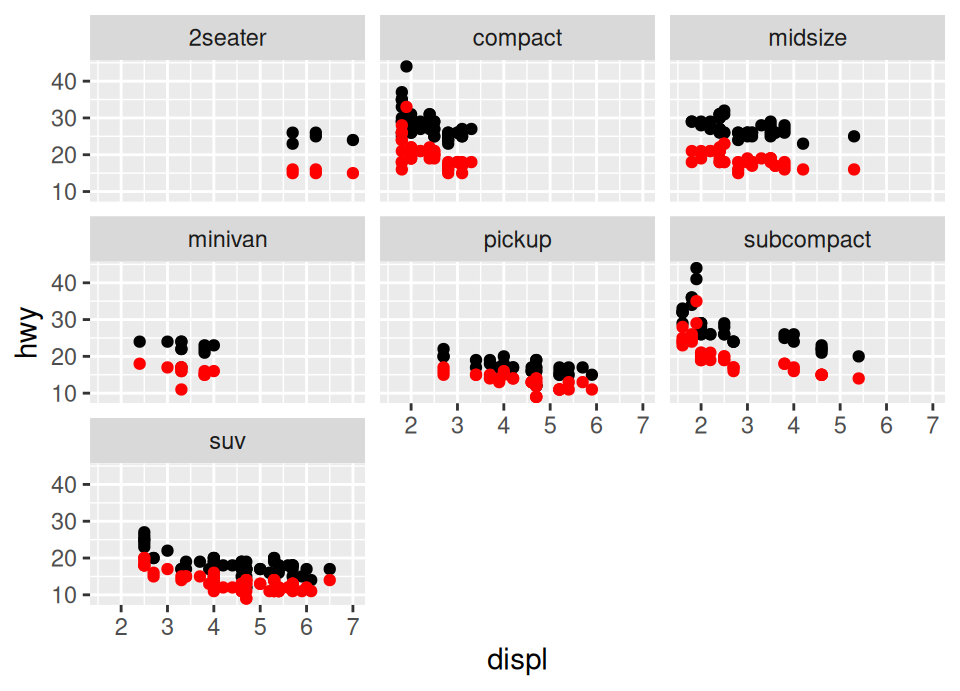
Exercise 5.62 Write the code to produce the following plot:
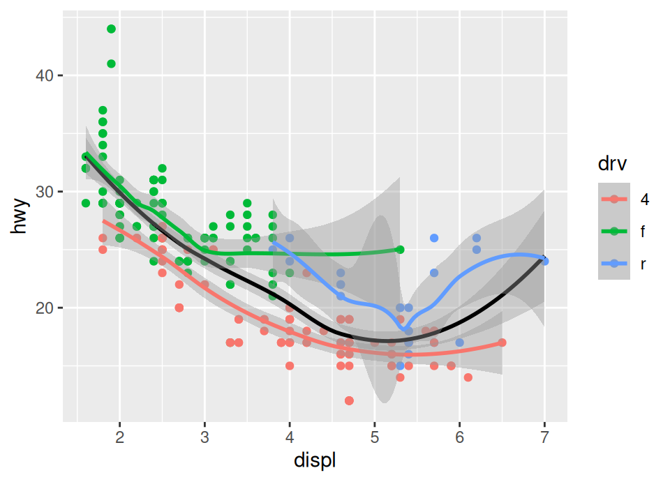
The black line is a smoother of the whole data, whilst the coloured lines are smoothers only for those coloured points.
Click for solution
When producing this we need to remember the rules ggplot2 uses. We can’t put the colour in the ggplot() plot creation call, because then it will apply to all geoms (and we need the black smoother not to be split by drive train).
Therefore, we put just x and y in the ggplot() call, add the points with the additional colour aesthetic, then add the black smoother line with the colour not specified as an aesthetic because it applies to all the data (instead, just a direct argument), then finally add another smoother with the colour in an aesthetic so that we get a smoother per drive train!
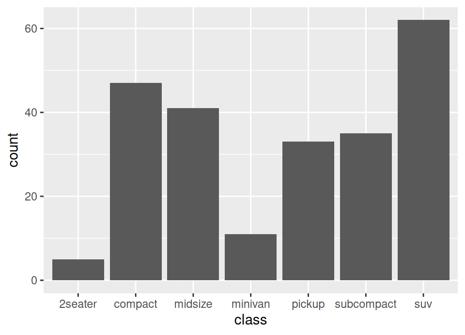
Exercise 5.63 Produce a bar plot of the count of the number of each type of vehicle in the data by using the Geom geom_bar(), with aesthetic x set to the vehicle type (NB: this question is to help you check if you are starting to understand the plotting system, because even though we didn’t show an example of a bar plot, this sentence alone should be enough information without needing to look at the documentation … the plotting system follows a coherent set of rules for all plot types!)
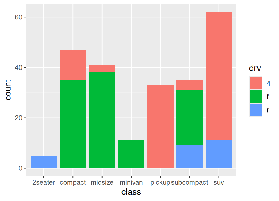
Make a second version where you also add an aesthetic fill which is set to the variable drv. What is this showing?
Click for solution
5.9 More plotting techniques 📊
Let’s stick with the mpg dataset for a moment longer to explore some other common plot types and how to label them professionally.
Exercise 5.64 Visualise the distribution of highway fuel efficiency (hwy) for each class of vehicle (class) using boxplots.
Hint: look at the ggplot2 cheat sheet on the web or PDF, or open the documentation for ggplot2 and browse through the available functions that start geom_ to find a suitable layer.
Click for solution
If you browse through, you should find a function named geom_boxplot.
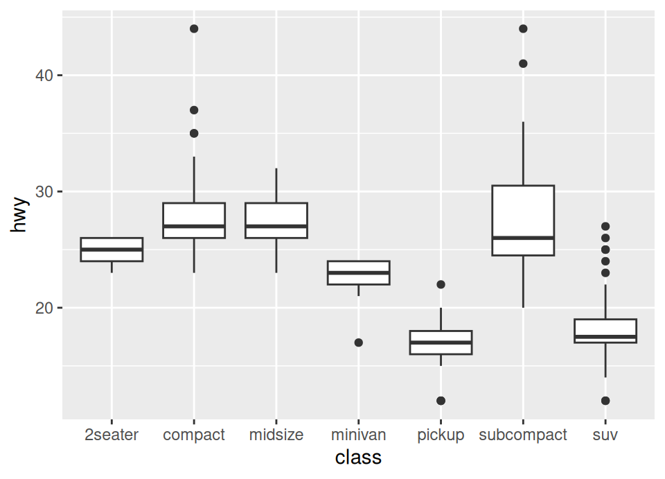
Exercise 5.65 Plots should be self-contained and easy to read. Take your boxplot from the previous exercise and:
- Add a main title “Highway Fuel Efficiency by Vehicle Class”.
- Add a subtitle “Source: EPA”.
- Update the axis labels to be “Vehicle Class” and “Highway MPG”.
Hint: look for the labs function documentation.
Click for solution
## SOLUTION

ggplot(mpg, aes(x = class, y = hwy)) +
geom_boxplot() +
labs(title = "Highway Fuel Efficiency by Vehicle Class",
subtitle = "Source: EPA",
x = "Vehicle Class",
y = "Highway MPG")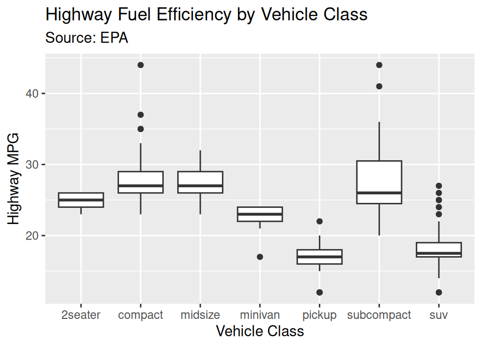
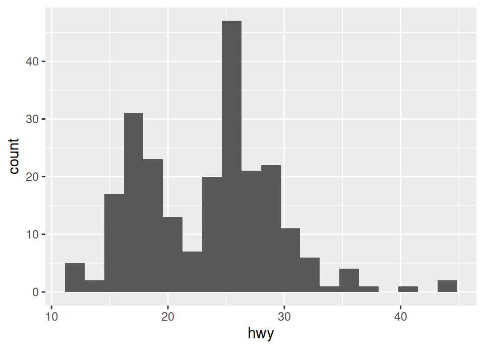
Exercise 5.66 It is common to get confused between geom_histogram, geom_bar and geom_col.
They each serve a slighlty different purpose even though they produce similar looking end results.
To distinguish them:
Histograms display the distribution of a continuous variable. The geometry for this is
geom_histogram(). Create a histogram ofhwy. Try changing from the default to use exactly 20 bins.Bar charts count the occurrences of categories. The geometry for this is
geom_bar(). Create a bar chart ofclass. Note you only need to mapx.Column charts plot pre-calculated values (heights) for categories. The geometry for this is
geom_col(). First, create a summary data frame calledclass_countswhich contains the count of eachclass. Then, plot this usinggeom_col. Note you need to map bothxandy.
Hint: to create the summary data frame, you might want to look up a new dplyr function for summarising a data frame with counts. Try looking at the dplyr cheat sheet on the web or PDF, or open the documentation for dplyr.
Click for solution
`stat_bin()` using `bins = 30`. Pick better value `binwidth`.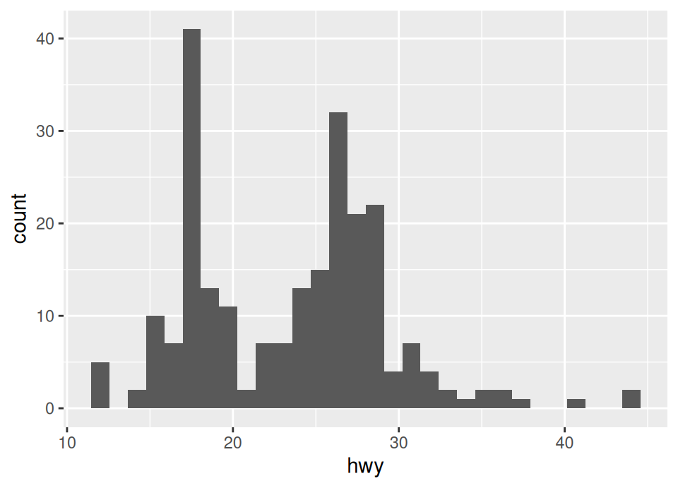
# ii. Bar chart (categorical variable, calculates counts automatically)
ggplot(mpg, aes(x = class)) +
  geom_bar()
When it comes to summarising, when looking at the PDF cheat sheet, you can see immediately at the start it shows that to summarise counts we can use the count() function.
# iii. Column chart (categorical variable, pre-calculated heights)
class_counts <- mpg |> count(class)

# Have a look at it
class_counts
# A tibble: 7 × 2
class n
<chr> <int>
1 2seater 5
2 compact 47
3 midsize 41
4 minivan 11
5 pickup 33
6 subcompact 35
7 suv 62# Now plot, using the variable names we see from the result of count()
ggplot(class_counts, aes(x = class, y = n)) +
geom_col()
5.10 New York City flights 🛫
We return to the NYC flights dataset, now knowing enough to try some new things with it. Recall how to load it from the last lab:
There are in fact additional data frames in the same package.
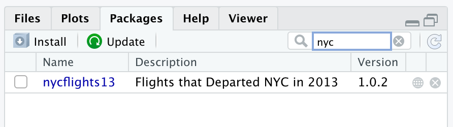
Exercise 5.67 By looking at the help file for the package or otherwise, find the names of all the data frames in the nycflights13 package and load them.
Click for solution
The easiest way to find the help file for a package is to go to the packages tab, search for the package, and click on the name …
… which reveals the 5 data frames in the package …
So, we can load the other 4 with:
This additional data has what is called a “relational” structure, meaning that there is a variable in one table that is a “key” to the entry in another, as will be explained by example in a moment. First, this is the structure between the various flight data sets:
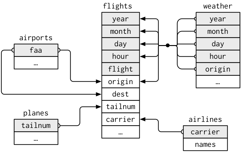
For example, this means that the faa column in the airports data set will contain unique values which match (possibly repeated) entries in the origin and dest columns in flights. Consequently, the airports data frame can be thought of as a way to look up the name (and other information) about a short airport code which is listed in the flights data.
Why not just have all that airports data in the flights data frame?!
Well, there are many flights associated with an airport, but the airport information is static and doesn’t change from one flight to the next (eg name, location etc don’t change between flights!).
Therefore, storing this directly in additional columns of the flights data frame would cause lots of redundant repeated information.
It is usually best practice to have this information in separate data frames in this way, and to just perform the necessary joins (as we learned in lectures!) where needed.
Exercise 5.68 Without running it, what does the following code do?
Now run that code and then create a data frame airports2 where you add a new column to airports containing the total number of flights between any New York airport and that destination (with NA if there are no flights).
Click for solution
The code shown will create a data frame called routes which contains 2 columns, dest and n, which shows the total number of flights that year between any New York airport (recall the origin is always one of the 3 New York airports) and the different destination airports in the flights data.
## SOLUTION
routes <- flights |>
  group_by(dest) |>
  summarise(n = n())
# Now, to create airports2 we need to use the new "by" argument we learned in
# the second exercise in this work sheet!
airports2 <- left_join(airports, routes, by = c("faa" = "dest"))
# Just look at a few rows to check it ... don't worry about NAs in the last
# column, these are just airports that had no flights to them from New York!
head(airports2)# A tibble: 6 × 9
faa name lat lon alt tz dst tzone n
<chr> <chr> <dbl> <dbl> <dbl> <dbl> <chr> <chr> <int>
1 04G Lansdowne Airport 41.1 -80.6 1044 -5 A Amer… NA
2 06A Moton Field Municipal Airport 32.5 -85.7 264 -6 A Amer… NA
3 06C Schaumburg Regional 42.0 -88.1 801 -6 A Amer… NA
4 06N Randall Airport 41.4 -74.4 523 -5 A Amer… NA
5 09J Jekyll Island Airport 31.1 -81.4 11 -5 A Amer… NA
6 0A9 Elizabethton Municipal Airport 36.4 -82.2 1593 -5 A Amer… NAInstall the maps package:
The maps package contains spatial information at various levels (national, regional, etc) that allows us to plot mapping data using the Geom geom_polygon.
Run the following code to produce a map of the USA:
# Get the latitude and longitude coordinate for mainland America:
usa <- map_data("usa")

# Plot these using geom_polygon
ggplot() +
  geom_polygon(aes(x = long, y = lat), data = usa, fill = "darkgreen")
Do you see how this works?
Look at the usa data frame and it is just a collection of coordinates defining the outline of the country!
Note that you can override the default data set for any Geom using the data = argument, which is what we did here (ie we did not specify the data or mappings in the opening ggplot() call, but overrode them in the geom_polygon() call, because we want to reserve the default dataset for other plotting in a minute …)
Exercise 5.69 What are the maximum and minimum longitude in the usa dataset, defining the most westerly and easterly longitudes of mainland America?
Use the answer to the above to overwrite your airports2 dataset, removing any airports not within the range of longitudes for mainland America.
Click for solution
[1] "long" "lat" "group" "order" "region" "subregion"[1] -124.6813[1] -67.00742Exercise 5.70 Add the airports2 dataset to the ggplot() call which creates the map above, then plot the latitude/longitude location of all mainland US airports by adding a geom_point() layer to create a scatterplot over the map. Change the size of the points to be half the default.
Note: if you run this on your own version of R on Windows, you might get a strange triangle cut-out in the map. This is unfortunately a bug in Windows rendering system, but you’ve not made a mistake in your code! Users on Linux, Mac or the Codespace should see the same map as in the solution below.
Click for solution
## SOLUTION

ggplot(airports2) +
  geom_polygon(aes(x = long, y = lat), data = usa, fill = "darkgreen") +
  geom_point(aes(x = lon, y = lat), size = 0.5)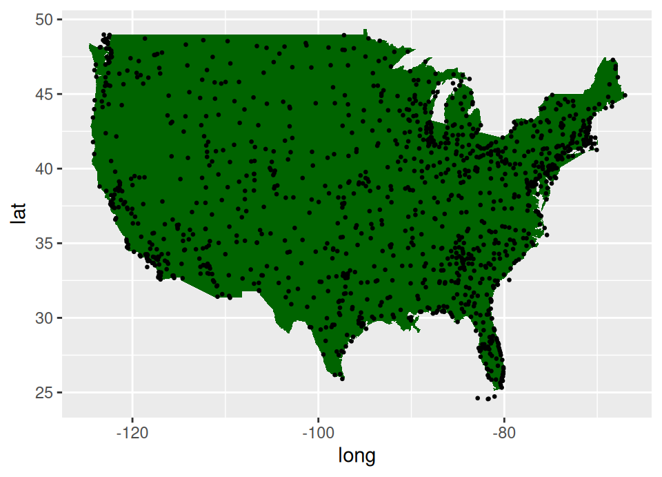
Exercise 5.71 Finally, update the geom_point layer by removing the fixed size and adding a size aesthetic linked to the variable n which we created earlier.
What does this graphic now show?
Click for solution
## SOLUTION

ggplot(airports2) +
  geom_polygon(aes(x = long, y = lat), data = usa, fill = "darkgreen") +
  geom_point(aes(x = lon, y = lat, size = n))
Warning: Removed 1096 rows containing missing values or values outside the
scale range (`geom_point()`).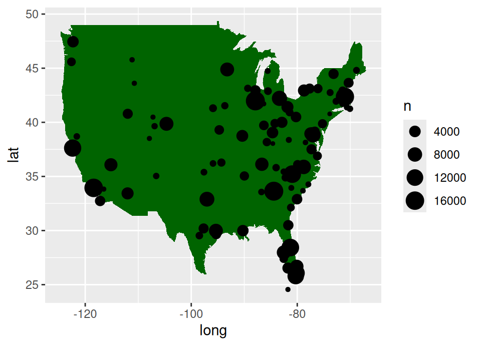
🏁🏁 Done, end of work sheet! 🏁🏁