class: center, middle, inverse, title-slide .title[ # Data Science and Statistical Computing ] .subtitle[ ## Practical Lecture 6<br>Advanced Graphics ] .author[ ### Dr Louis Aslett ] .institute[ ### Durham University ] .date[ ### 14 November 2024 ] --- <style type="text/css"> .smaller .remark-code { /*Change made here*/ font-size: 80% !important; } </style> ## One more data wrangling item ... We found the "tidy" form for the WHO data in the last lecture was: .smaller[ ``` r who ``` ``` country year cases population 1 Afghanistan 1999 745 19987071 2 Afghanistan 2000 2666 20595360 3 Brazil 1999 37737 172006362 4 Brazil 2000 80488 174504898 5 China 1999 212258 1272915272 6 China 2000 213766 1280428583 ``` ] What to do if you have not just *untidy* but also *split* data across multiple data frames? .pull-left[ .smaller[ ``` r who_cases ``` ``` country 1999 2000 1 Afghanistan 745 2666 2 Brazil 37737 80488 3 China 212258 213766 ``` ] ] .pull-right[ .smaller[ ``` r who_population ``` ``` country 1999 2000 3 China 1272915272 1280428583 2 Brazil 172006362 174504898 1 Afghanistan 19987071 20595360 ``` ] ] --- ## Joining data frames (I) - Simplest cases: - `rbind()` paste rows together (above/below) - `cbind()` paste cols together (left/right) ``` r rbind(who_cases, who_population) ``` ``` country 1999 2000 1 Afghanistan 745 2666 2 Brazil 37737 80488 3 China 212258 213766 31 China 1272915272 1280428583 21 Brazil 172006362 174504898 11 Afghanistan 19987071 20595360 ``` ``` r cbind(who_cases, who_population) ``` ``` country 1999 2000 country 1999 2000 3 Afghanistan 745 2666 China 1272915272 1280428583 2 Brazil 37737 80488 Brazil 172006362 174504898 1 China 212258 213766 Afghanistan 19987071 20595360 ``` --- class: inverse, middle, center ## 🚨🚨 Warning! 🚨🚨 `rbind()` and `cbind()` can be very error prone unless: - for `rbind` you know the variables are identical and in the same order - for `cbind` you know that the observations are in the same order --- ## Joining data frames (II) - `left_join(x, y)` add new variables from `y` to `x`, keeping all `x` obs - `right_join(x, y)` add new variables from `x` to `y`, keeping all `y` obs - `inner_join(x, y)` keep only matching rows - `full_join(x, y)` keep all rows in both `x` and `y` <img src="i/joins.png" alt="Table images CC BY SA RStudio Inc." width="62%" style="display: block; margin: auto;" /> --- ## Joining WHO data (I) ``` r library("tidyverse") left_join(who_cases, who_population) ``` ``` country 1999 2000 1 Afghanistan 745 2666 2 Brazil 37737 80488 3 China 212258 213766 ``` 😳 Ooops! No! Can you see what happened? --- ## Joining WHO data (II) ``` r left_join(who_cases |> pivot_longer(c("1999", "2000"), names_to = "year", values_to = "cases"), who_population |> pivot_longer(c("1999", "2000"), names_to = "year", values_to = "population")) ``` ``` # A tibble: 6 × 4 country year cases population <chr> <chr> <dbl> <dbl> 1 Afghanistan 1999 745 19987071 2 Afghanistan 2000 2666 20595360 3 Brazil 1999 37737 172006362 4 Brazil 2000 80488 174504898 5 China 1999 212258 1272915272 6 China 2000 213766 1280428583 ``` --- ## Joining WHO data (III) Order doesn't matter! It matches the correct values up for us (unlike `cbind`) ... ``` r left_join(who_cases[c(3,1,2),] |> pivot_longer(c("1999", "2000"), names_to = "year", values_to = "cases"), who_population |> pivot_longer(c("1999", "2000"), names_to = "year", values_to = "population")) ``` ``` # A tibble: 6 × 4 country year cases population <chr> <chr> <dbl> <dbl> 1 China 1999 212258 1272915272 2 China 2000 213766 1280428583 3 Afghanistan 1999 745 19987071 4 Afghanistan 2000 2666 20595360 5 Brazil 1999 37737 172006362 6 Brazil 2000 80488 174504898 ``` --- ## "Cheat sheets" -- highly recommended! 😎 [https://www.rstudio.com/resources/cheatsheets/](https://www.rstudio.com/resources/cheatsheets/) <img src="i/cheat-sheets.png" alt="Table images CC BY SA RStudio Inc." width="70%" style="display: block; margin: auto;" /> **NOTE:** These **are** allowed in the computer exam, they are not "cheating" for purposes of assessment on this course! --- class: middle, center ## `ggplot2` --- class: middle ## Presentation or exploration? <img src="i/present-vs-explore.jpg" width="100%" /> --- ## `ggplot2` - Included as part of the Tidyverse - Creates a "grammar of graphics" - Build up plots in layers that you can stack and reorder easily - Automatically constructs appropriate plot at the end of *all* commands (ie no more worrying about order of commands for x/y axis scales, etc) - Publication quality graphics, very professional appearance -- ``` r # Either ... library("tidyverse") # for all tidyverse packages # OR, for just plotting library("ggplot2") ``` --- ## `ggplot()` Every plot starts with this function. Optional arguments: - `data` to specify the data frame containing the variables we later reference in the plot - `mapping` to specify what variables map to the x axis, y axis, colour legend, etc etc - mappings are always specified by a call to `aes()` For example, ``` r data("diamonds", package = "ggplot2") ggplot(diamonds, aes(x = carat, y = price)) ``` --- ``` r ggplot(diamonds, aes(x = carat, y = price)) ``` 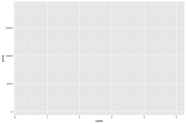<!-- --> Axes are scaled, but where is the data? We haven't specified *what* plot to do, just what data to use! --- Use "Geoms" to specify how data is plotted by "adding" `+` to the plot. ``` r ggplot(diamonds, aes(x = carat, y = price)) + geom_point() ``` 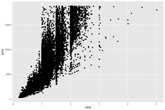<!-- --> --- ## Geoms Geoms inherit the `data` and `mapping` from the original `ggplot()` call, but can be overridden (or added to with `aes`). Some Geoms have their own special set of options relevant to the plot type. Each Geom builds up layers in the order you call them (so to change any overplotting, change the order of addition to the plot) Legends etc for colours, line types etc is all automatic. --- ``` r ggplot(diamonds, aes(x = carat, y = price)) + geom_point(aes(colour = cut)) ``` 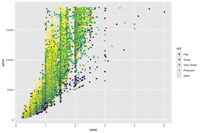<!-- --> --- ``` r ggplot(diamonds, aes(x = carat, y = price)) + geom_point(aes(colour = cut), size = 0.2) ``` <!-- --> --- ``` r ggplot(diamonds, aes(x = carat, y = price)) + geom_point(aes(colour = cut), size = 0.2) + geom_smooth() ``` ``` `geom_smooth()` using method = 'gam' and formula = 'y ~ s(x, bs = "cs")' ``` 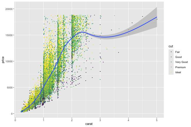<!-- --> --- ``` r ggplot(diamonds, aes(x = carat, y = price)) + geom_smooth() + geom_point(aes(colour = cut), size = 0.2) ``` ``` `geom_smooth()` using method = 'gam' and formula = 'y ~ s(x, bs = "cs")' ``` <!-- --> --- ``` r ggplot(diamonds, aes(x = carat, y = price)) + geom_point(aes(colour = cut), size = 0.2) + geom_smooth() + xlab("Number of carats") + ylab("Price in $") ``` ``` `geom_smooth()` using method = 'gam' and formula = 'y ~ s(x, bs = "cs")' ``` <!-- --> --- ``` r ggplot(diamonds, aes(x = carat, y = price)) + geom_point(aes(colour = cut), size = 0.2) + geom_smooth(aes(colour = cut)) + xlab("Number of carats") + ylab("Price in $") ``` ``` `geom_smooth()` using method = 'gam' and formula = 'y ~ s(x, bs = "cs")' ``` <!-- --> --- ``` r ggplot(diamonds, aes(x = carat, y = price)) + geom_hex() ``` <!-- --> --- class: inverse ## Key resources 👀 - Documentation reference: - https://ggplot2.tidyverse.org/reference/index.html - Cheat sheet - [https://raw.githubusercontent.com/rstudio/cheatsheets/main/data-visualization.pdf](https://raw.githubusercontent.com/rstudio/cheatsheets/main/data-visualization.pdf) ... ggplot2 is a huge project, you need to read the docs to learn it! But, picking it up once you have the basics is easy, because very coherent interface. --- ``` r ggplot(diamonds, aes(x = carat, y = cut)) + geom_boxplot() ``` <!-- --> --- ``` r ggplot(diamonds, aes(x = cut, y = carat)) + geom_boxplot() ``` <!-- --> --- ## Plots in variables ``` r data("mtcars") p <- ggplot(mtcars, aes(x = hp, y = mpg)) + geom_point() p + geom_smooth() p + geom_smooth(method = "lm") p + scale_y_log10() + scale_x_log10() + geom_smooth(method = "lm") p + scale_y_log10() + scale_x_log10() + geom_smooth(method = "lm") + geom_vline(xintercept = 100) ``` --- ## Stats Many of the Geoms might need to be tweaked in how they calculate summaries, and some summaries don't have an explicit Geom: ``` r ggplot(diamonds, aes(x = carat, y = price)) + stat_bin_hex(bins = 60) ``` ``` r ggplot(mtcars, aes(x = mpg)) + stat_ecdf() ``` --- ## Faceting Faceting enables splitting your data into multiple plots according to a categorical variable. - `facet_wrap()` single variable split - formula notation to indicate splitting variable `~ var` - optionally specify number of rows - `facet_grid()` two variable split - formula indicating both splitting variables `rows_var ~ cols_var` --- ``` r ggplot(mtcars, aes(x = hp, y = mpg)) + facet_wrap(~ gear) + geom_point() ``` <!-- --> --- ``` r ggplot(mtcars, aes(x = hp, y = mpg)) + facet_grid(cyl ~ gear) + geom_point() ``` <!-- -->